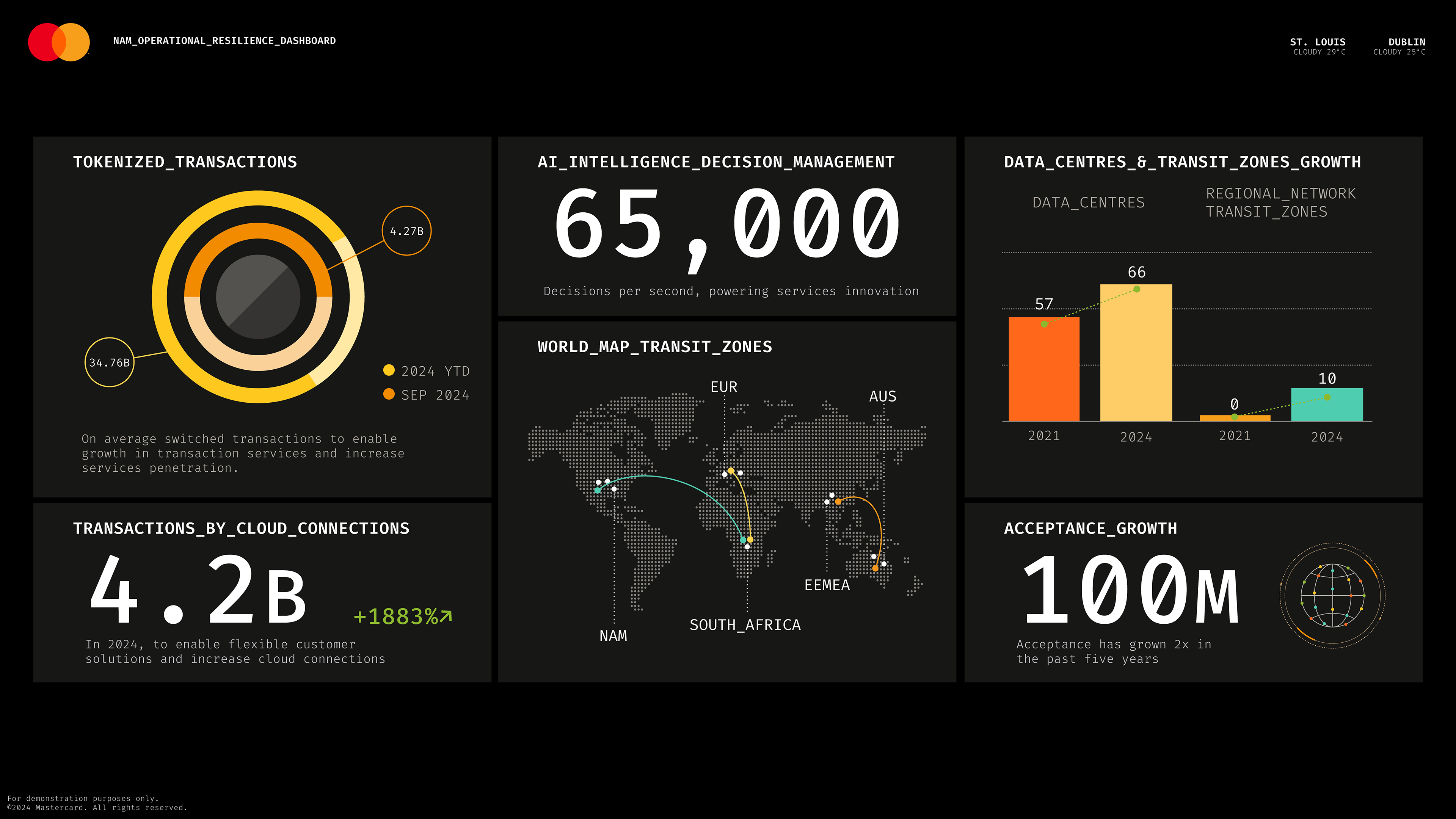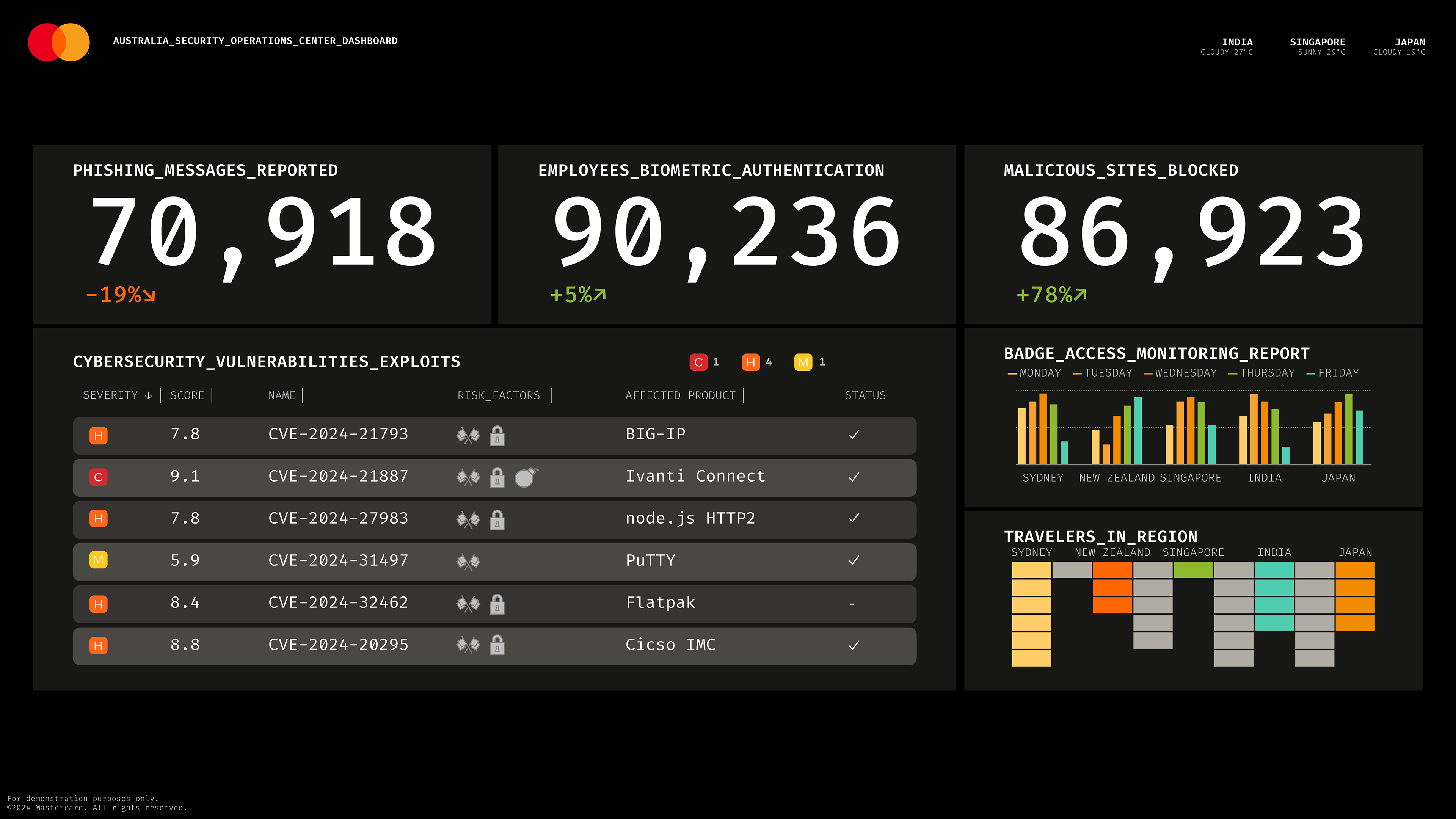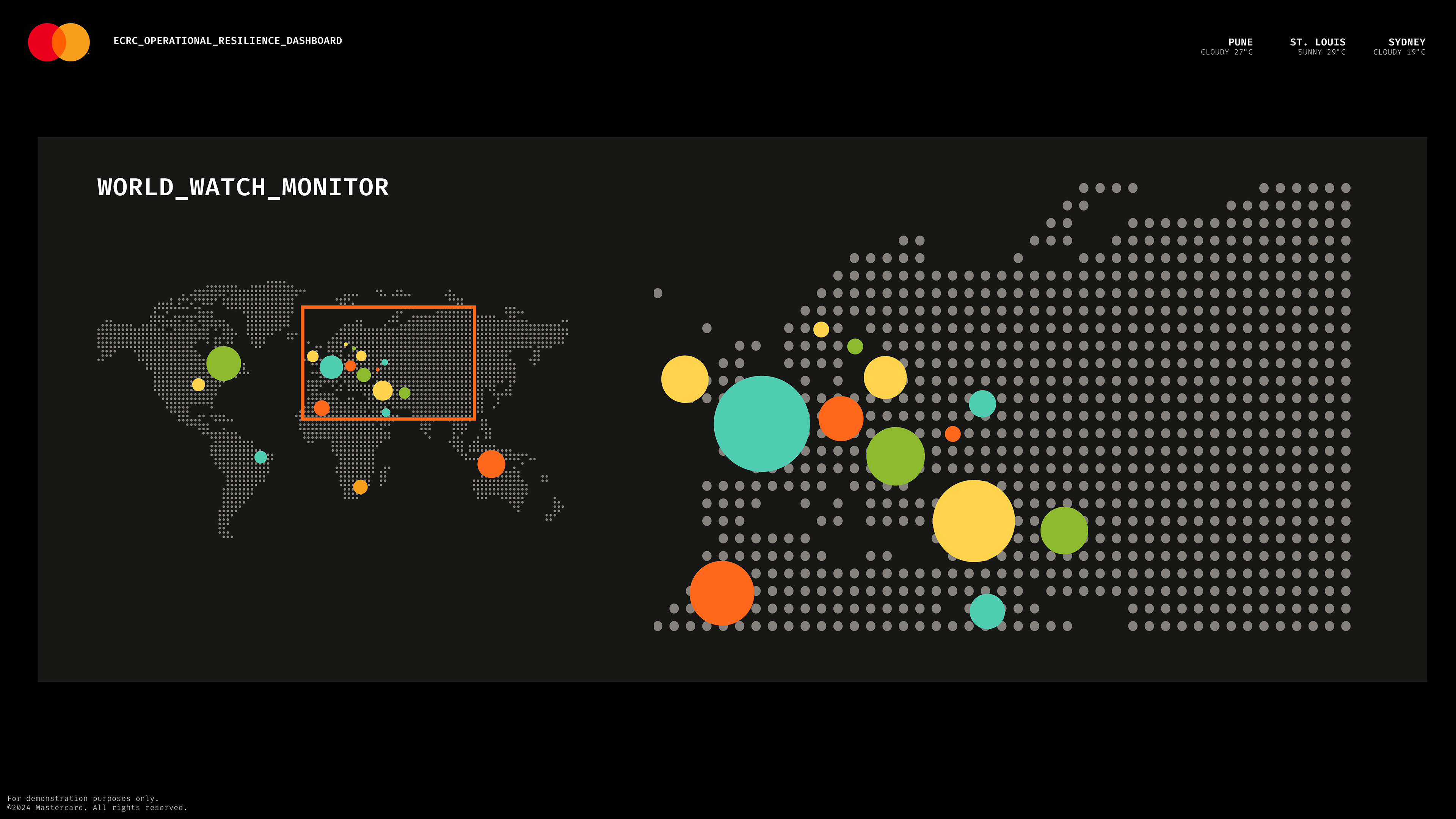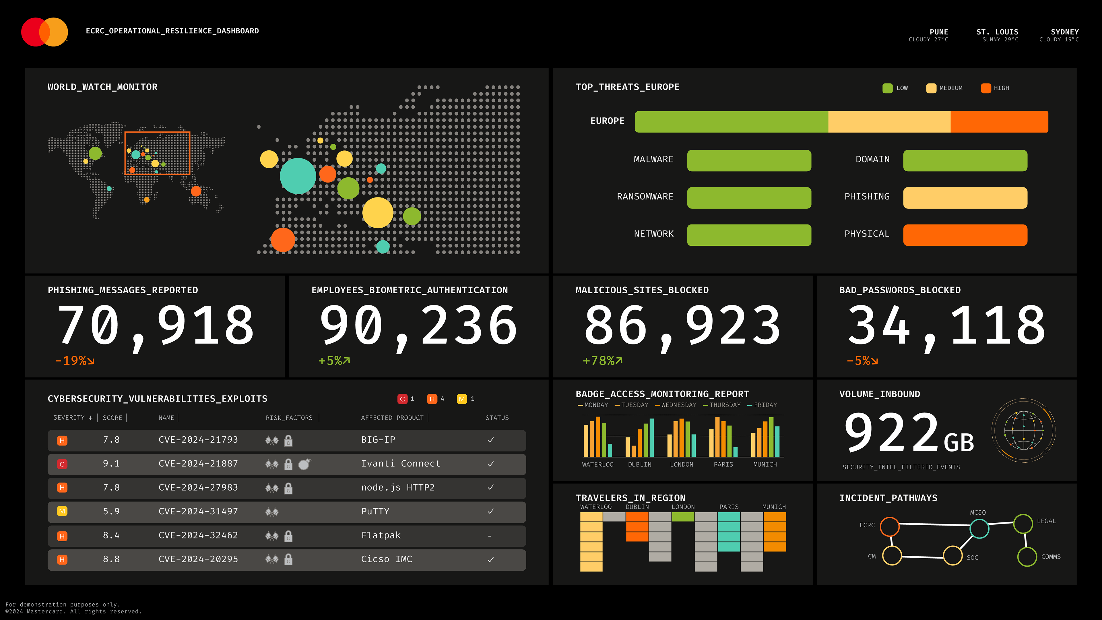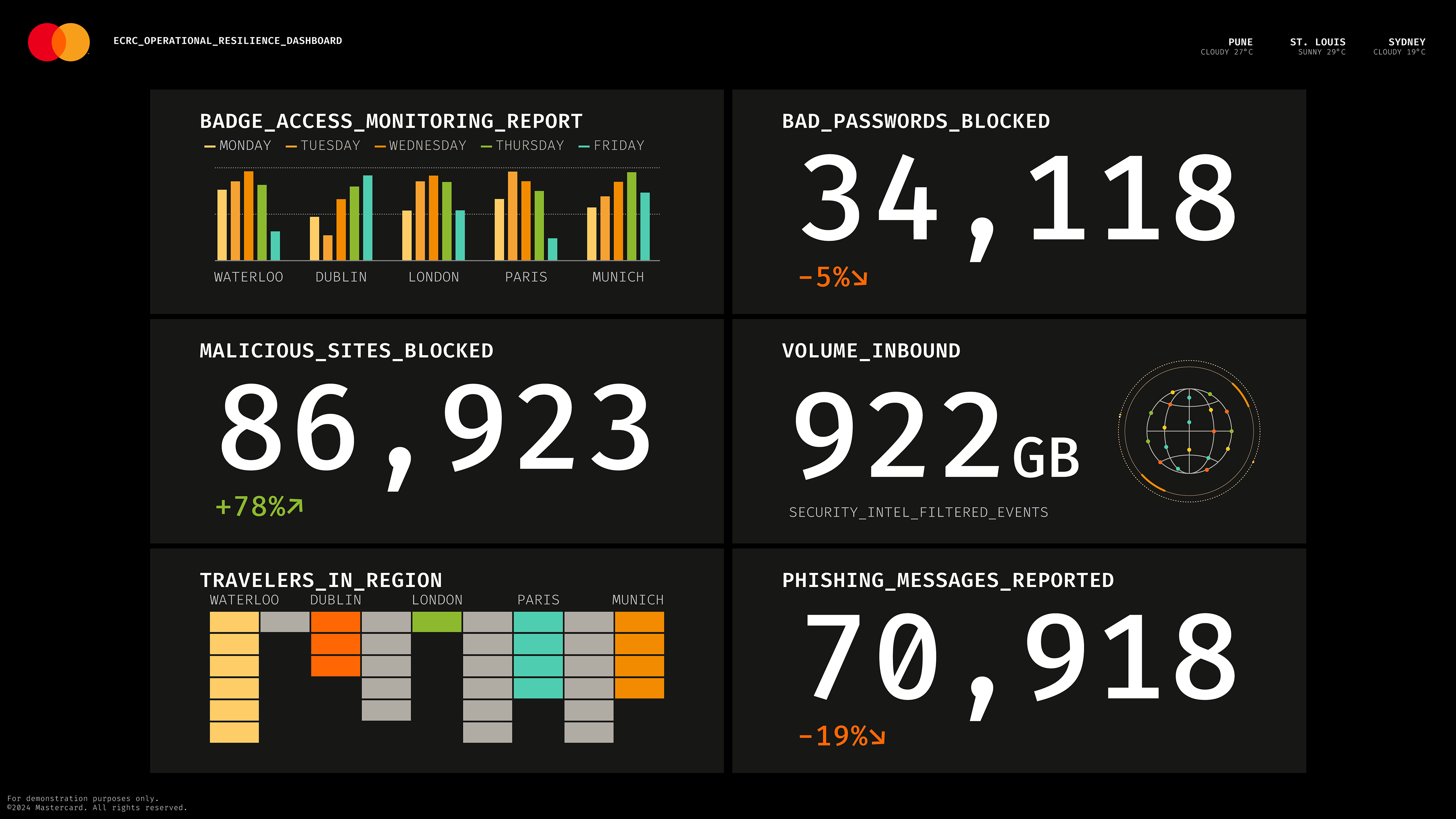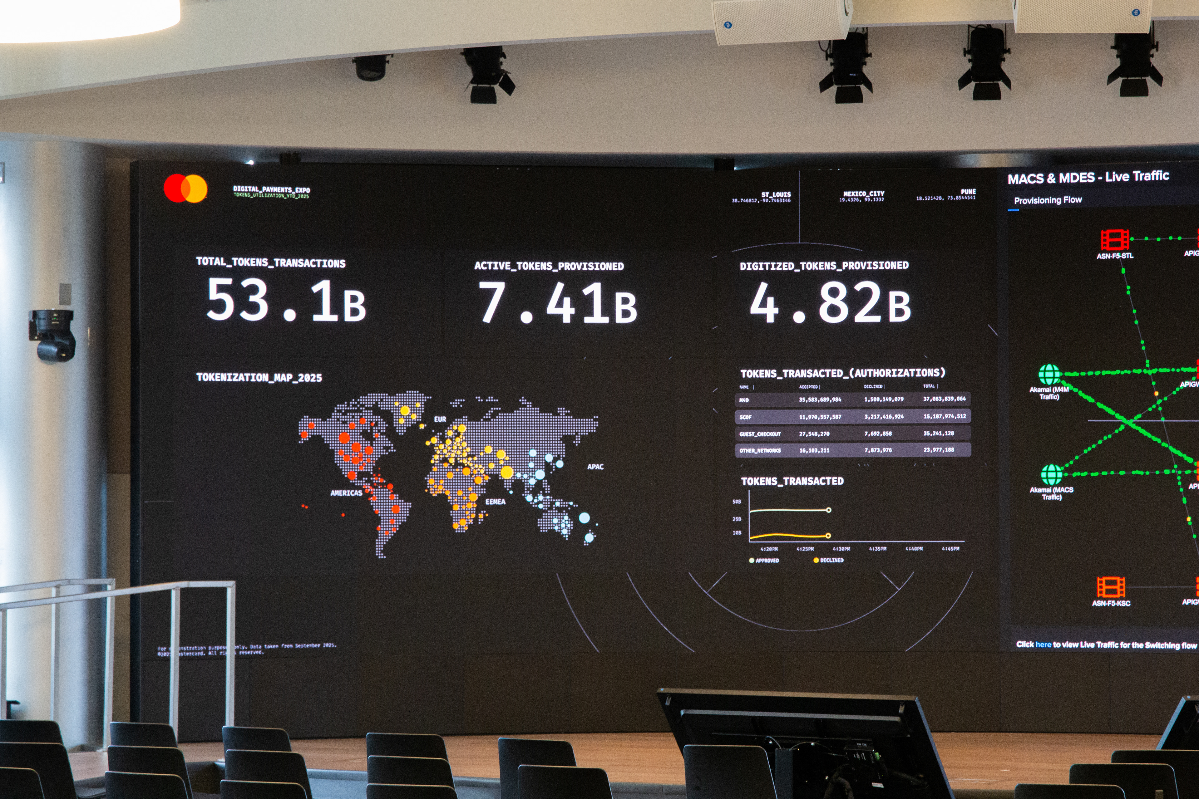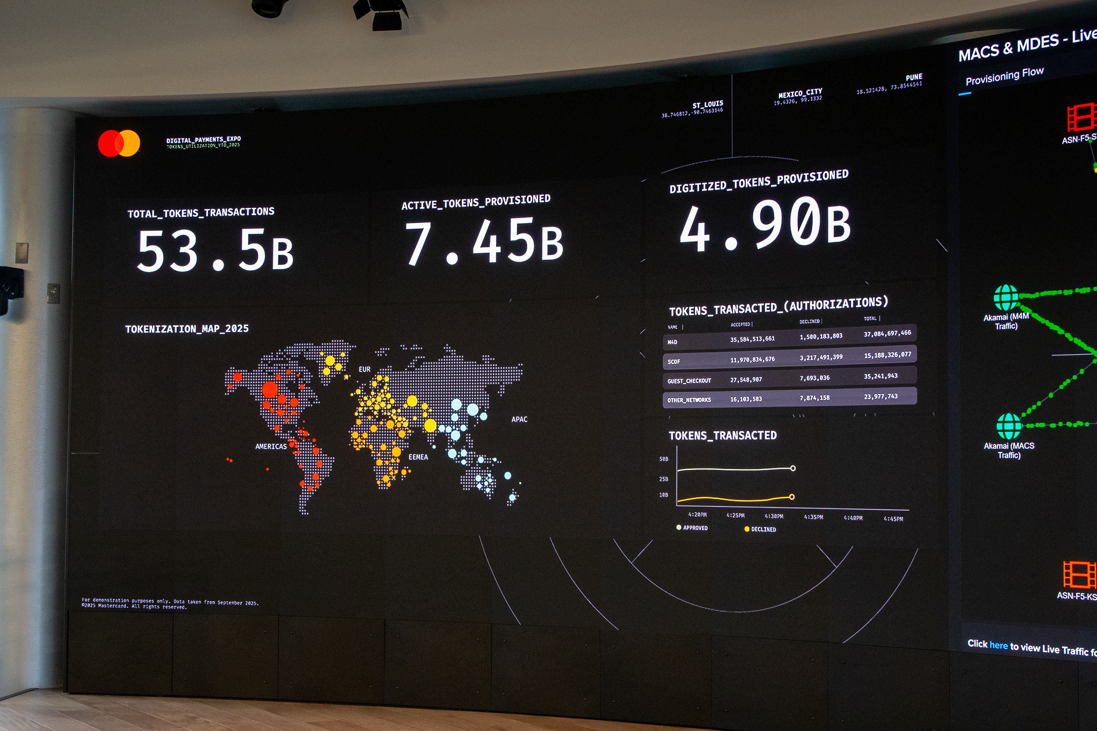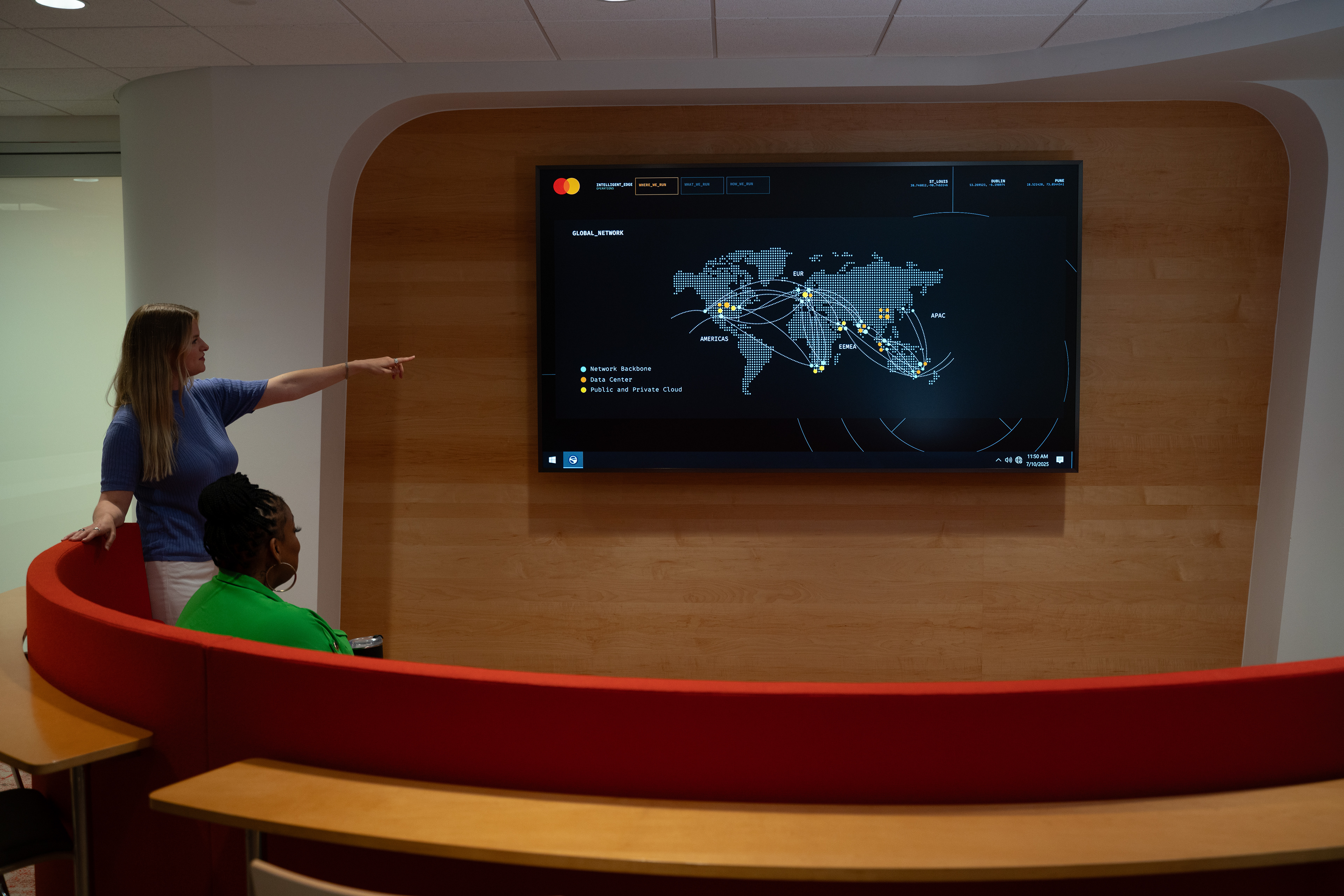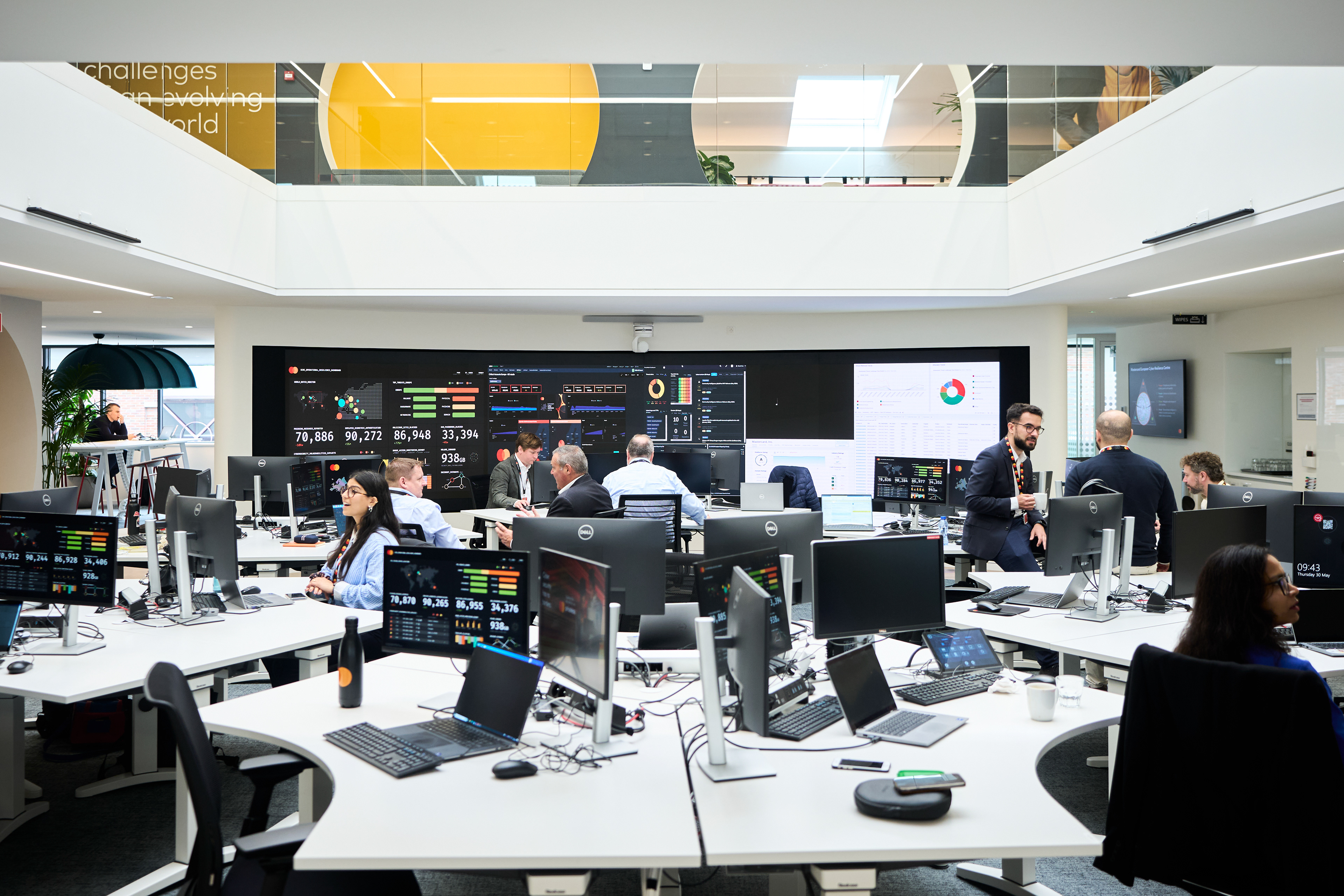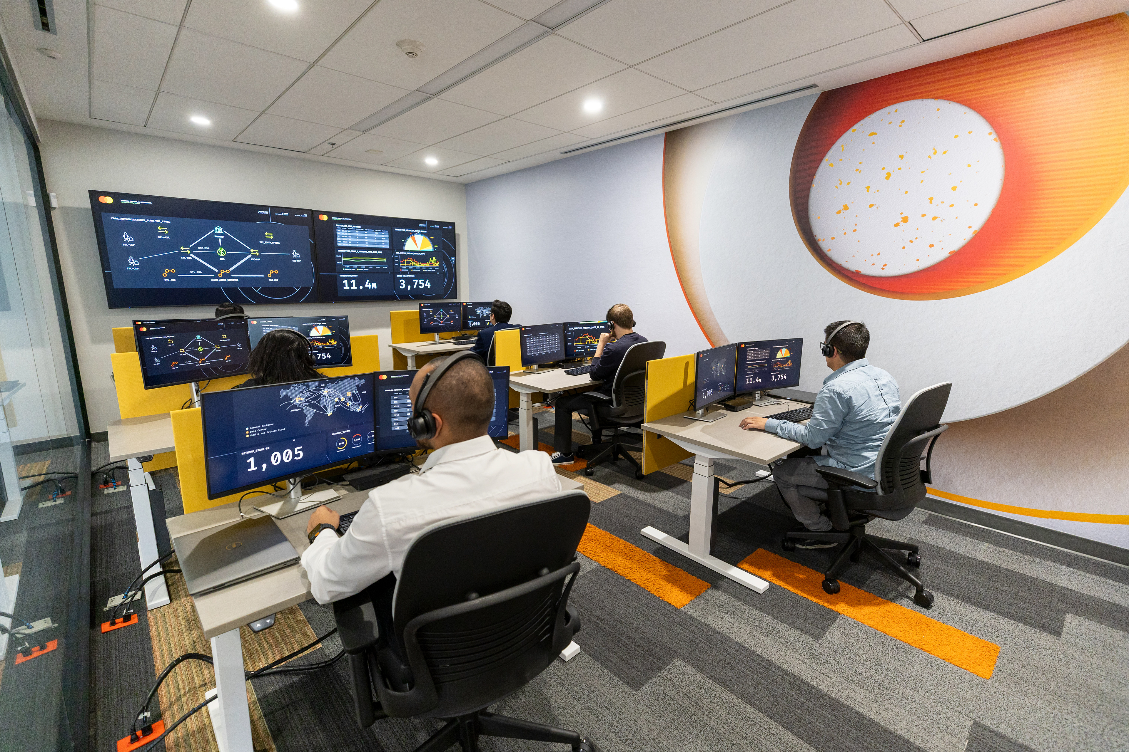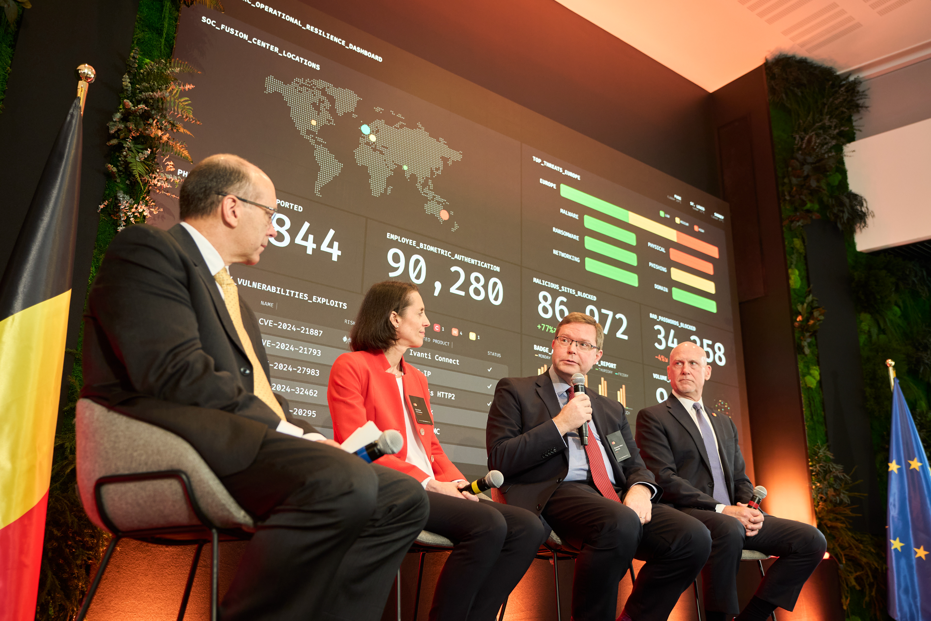

At Mastercard, we use Domo and Tableau for data analytics, insights, and visualizing. However, the way information was presented was not cohesive and lacked an overall look and feel that denoted Mastercard.
I created a design system for data visualizations and dashboards at Mastercard that ensures each viewer can quickly and easily understand the information being presented.
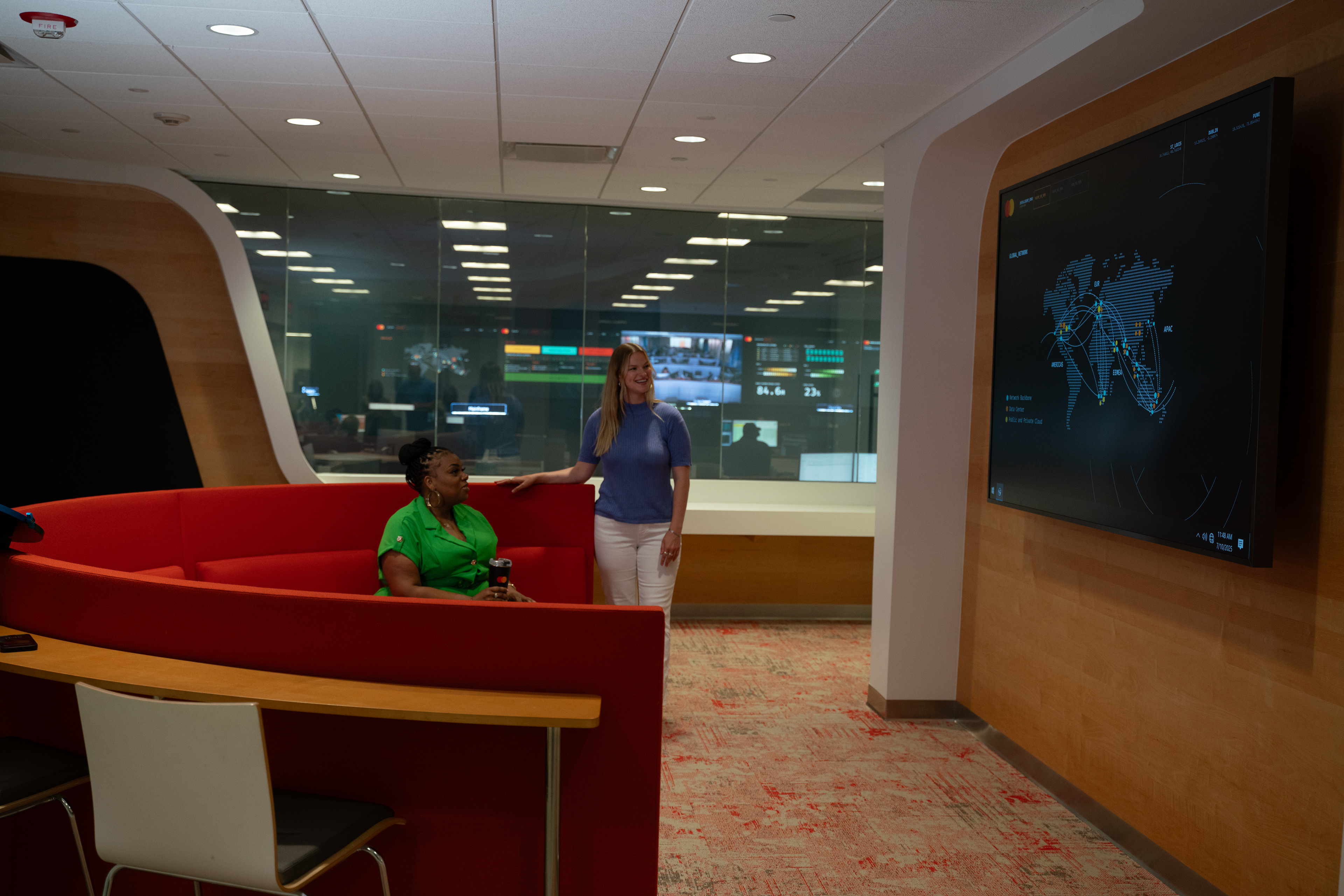
The dashboards can now be viewed in:
Waterloo, Belgium,
Pune, India,
Mexico City, New Mexico
St. Louis, Missouri
New York City, New York
Sydney, Australia
Waterloo, Belgium,
Pune, India,
Mexico City, New Mexico
St. Louis, Missouri
New York City, New York
Sydney, Australia
But the list grows every day!

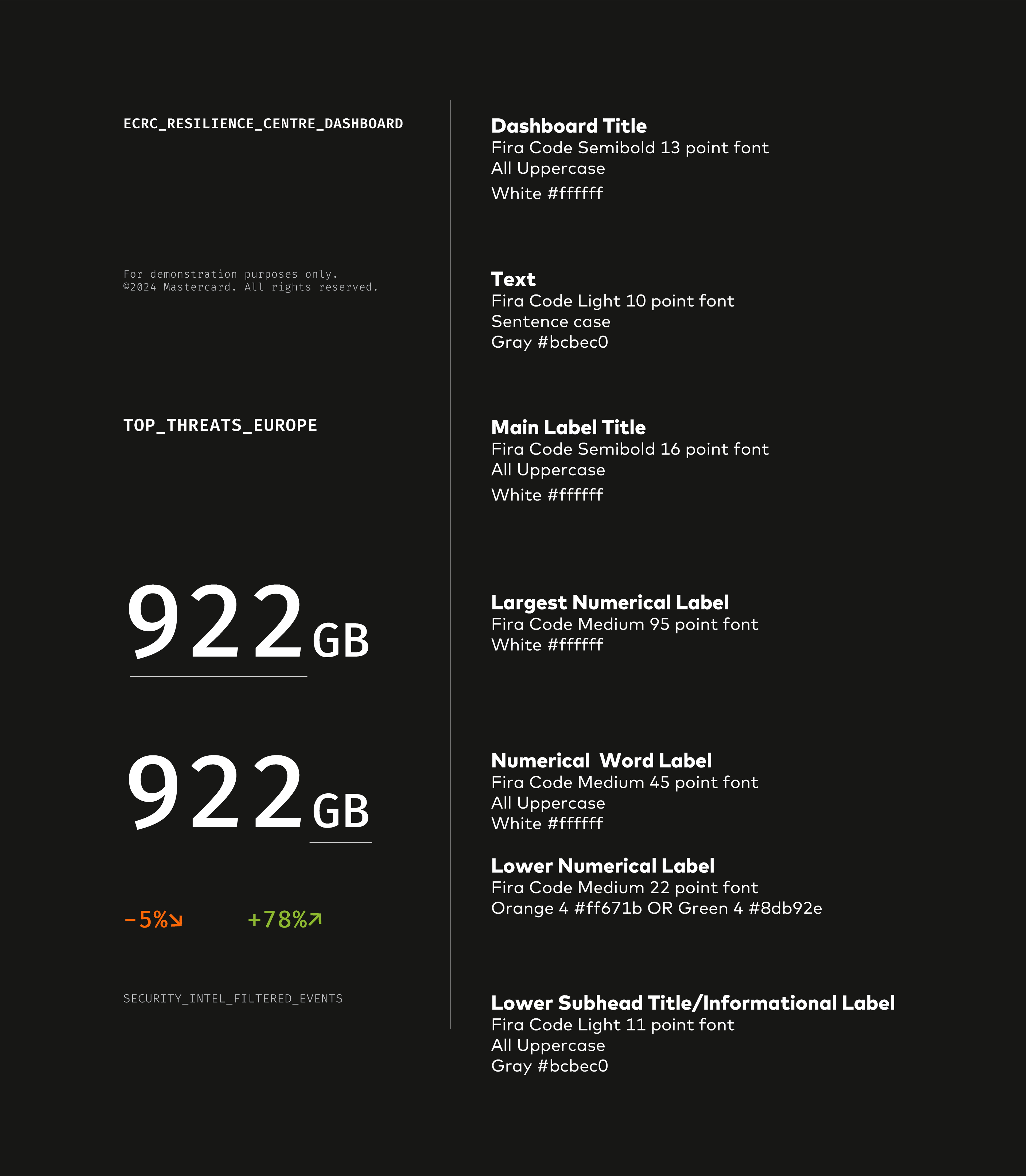
The end result is a cohesive, vibrant dashboard that depicts information clearly and concisely.